Neue Rasant fonts from Neue - (auvav)
 |
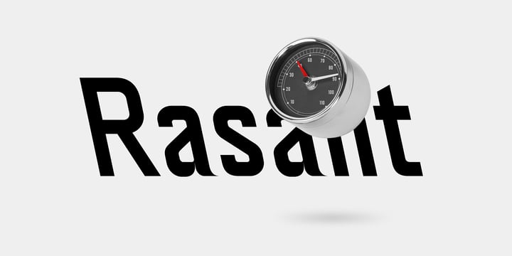
→ neue Rasant is an interpretation of a typeface used by the Singapore Land Transit Authority for its directional signage. The typeface design is based on a rigid grid with little to no room for optical compensations or any kind of harmonisation whatsoever. This approach can be seen as epitomic to an engineer’s way of designing which offers paradoxically unorthodox solutions in a seemingly orthodox system.
→ neue Rasant is a uniwidth design which means that the individual characters are occupying the same amount of space across all weights and styles. This way of designing a type family turns out handy if one wants to avoid unintentional line breaks or space consumption.
→ neue Rasant comes in five weights ranging from Thin to Bold. For the Italics the designer has the choice between
a traditional slant to the right or an unconventional slant to the left. All weights and styles are equipped with arrows matching the individual weight’s stroke thickness.
→ For trial and variable fonts reach out to hi@neuefoundry.com